Opinion
The iPhoto Challenge III
Welcome to the Machine
To use iPhoto is to submit to the dictatorial constraints of the OS X police state. Forget choice, forget flexibility; it's the Apple Way or the highway. This is Steve Jobs' world, you're just printing books in it. Or so what many critics would have you to believe. In this installment of The iPhoto Challenge (if you're late to class, please catch up with Part I and Part II), I'm going to delve into what was traditionally the most limiting aspect of iPhoto, its file management, and try to assess whether it truly is evil incarnate, or simply misunderstood and seeking love.
iPhoto's 5's ability to create hierarchal folders is its single best improvement over previous versions, and probably the only reason I'm even conducting this challenge. You've already seen a jillion screenshots of (or are already using) the new folder function, so there really isn't much else to say; you make a folder in iPhoto's sidebar and drop albums (or other folders) in it. Simple. Obvious. And four versions late. iView's equivalent is the "Catalog Sets" feature, which uses "Containers" and "Sets" as analogous to iPhoto's Folders and Albums. It works just as well, although I do find iPhoto's terminology and visual cue of folders and albums to be more intuitive.

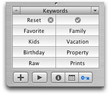
Folders aren't the only improvement, of course. Keywords are now front and center, no longer (entirely) banished to a buried dialog, but I never really use them much in my personal image management. It seems to me keywords are meant for people who need to find images they don't know the location of; in other words, not you. If you need to keyword your Telluride photos as "ski trip 2002" so you can find them, then your base album organization is probably pretty weak. I did however, come across one good use of keywords in iPhoto which helped solve a vexing problem, and it has to do with Smart Folders.
Part of my traditional workflow in iView is to have a folder called "Prints", where I save edited images expressly for printing. The Prints folder is in my iView catalog and set to auto-update. But how to do that in iPhoto, which doesn't recognize folders outside its own filesystem? The solution is simple:
1. Create a smart album that matches the keyword "Prints"
2. Duplicate the image in iPhoto.
3. Keyword the dupe as "Prints"
The duped image that was keyworded as a "Prints" will now automatically appear in the smart album. Now I can edit that dupe all I want, and not only is the original safe, but I can now create multple edit iterations of an image without the worry of accidentally saving over an original in Photoshop.

The King of Panes
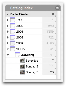
iPhoto 5 has a host of new organizational and searching abilities that really strengthen its usability. Unfortunately, much of it feels just slightly "wrong". Take the calendar pane in the sidebar. I want to like it, I really do, but it doesn't feel as direct and easy to use as iView's hierarchal date view (shown at right). For one thing, it's contextual; it will only show images contained within the selected album. This is annoying, as at any given time I might have one album selected, but want to quickly go to an image from a different year. I'm stopped dead in my tracks because I have to go up and choose the right album (usually the Library, so I don't leave any dates filtered). The same thing applies to the search field. You can search by title, comment, keyword or filename, but again is contextual. Why it doesn't automatically use the whole library as the basis for search is beyond me.

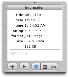
iPhoto 5 has an "Info" pane in the sidebar with basic file data; title, date, time, rating, format and size. The first three fields are editable, but only affect iPhoto's database, not the image's embedded EXIF info (which is a good thing in my opinion; if you're inclined to muck with EXIF data, you probably aren't using iPhoto anyway). Note: do not confuse the "Info" sidebar pane with the "Get Info" (cmd-i) panel, which shows almost totally different information: EXIF data divided between two tabs, and a third, which is used to apply Keywords, a function that's (sort of) duplicated in a sidebar pane. Confused yet? Read on...
The Keyword pane is primarily for filtering keyword views, not applying them. To do that, you awkwardly drag the files onto the keyword button, or worse still, opt-drag to remove them. To apply keywords the way god intended, you need the Info Panel (cmnd-i); simple enough, but this panel is a fixed size that I have trouble finding a comfortable location for on my screen. Again, why couldn't this panel (including the EXIF tabs) be incorporated into a sidebar pane? Ya know, like iView?
The Wind-Up
Perhaps it's partially due to iPhoto's clean, simple interface and lack of feature bloat, but I find using the folders (smart or otherwise) to be fun. They give me new, efficient approaches to organizing my images. But to get to this point, I really had to let go of thinking of my "actual" files sitting in buried folders created by iPhoto, and let the virtual album/folder/roll metaphor do the job. As I said in the first part of this series, we all pretty much do this already with iTunes, so there's no reason that the same shouldn't apply to iPhoto; and in terms of file organization, I think it's finally there. Minor quibbles persist of course (mainly the calendar and image info UI), but so far they aren't a deal breaker.
Next week I'll tackle iPhoto 5's image editing, export and overall performance/responsiveness, and I'll say right now it's not gonna be pretty.
(note: iPhoto 5.0.1 has just been released, and fixed the bugs I described in part I of this series. Woo-hoo Apple.)
Wrapping it up in [Part IV...](http://www.automatorworld.com/archives/the-iphoto-challenge-iv/)


 Workflows

You say: “If you need to keyword your Telluride photos as “ski trip 2002? so you can find them, then your base album organization is probably pretty weak.”
Um, well, yeah, if all you do is a strict hierarchy or one-keyword-per-image, that’s very true.
On the other hand, my keyword system lists all subjects in a photo, any holiday it was associated with, and a few others on occasion (like, “School Portrait”, which denotes, … well, guess.)
This allows me to, with a couple clicks, view all the “best” (rating>=4) pictures of William last Christmas. Another click can “broaden” to 3+ ratings, or to all kids that Christmas, or to all William’s best pictures sorted by date …
The idea of keywords is more akin to a free-form database than to a hierarchy. While they each have their uses, it’s best not to use one when the other is really what’s needed.
Personally, I never drag images to the keywords pane; I use that strictly to filter the current album. Didn’t know you could even do such a thing until I stumbled across it on a web site; I personally don’t like that UI if on nothing other than principle, so I pretend it doesn’t exist :). I use the “Get Info” floater for keyword selection. My only gripe there is the delay (even on a 2x2GHz G5) between clicking the keyword checkbox and iPhoto finishing its job. Yeah, the floater window always gets in the way no matter where you put it. Since I do my keywording immediately after importing, I hover the pane over the folder tree in the top-left while working.
Comment by Tom Dibble — April 27, 2005 @ 6:07 pm
My comment regarding keywords was snarky, to be sure, but not intended to disparage keyword use in general..I’ve just not found them particularly useful in my *personal* image management (business use is a completely different story).
iPhoto’s keyword UI has been a problem since 1.0, and it’s only marginally better now. What really blows my mind is that you cant assign keywords via the contextual menu. That would solve most all keyword problems. They should also be assignable keyboard shortcuts, like iView.
Comment by Steve — April 27, 2005 @ 7:24 pm
Not only is it annoying that the Photos–>Get Info… pane is fixed-size, but unlike say, Command-J in the Finder, Command-I doesn’t toggle the Get Info… pane on and off. Aiming for extra-small red dots to close a window is one of my least favorite mousing maneuvers. And this from the folks who brought us the Human Interface Guidelines?!
The good news is that, if you’ve bothered to install Apple’s (free) Developer tools, you can tweak the Get Info… pane yourself by opening its nib file in Interface Builder. This requires a bit of messing about to get the settings right, but it’s worth it to get a resizable, Command-W closable window. :)
A few notes about this:
* The nib file is located in iPhoto’s Contents folder: iPhoto/Contents/Resources/English.lproj/InfoPanel.nib
* Make sure to back up this file before editing it!
* You’ll need to quit and reopen iPhoto a lot as you tweak the pane to get it just how you like it, especially since there are so many UI elements in this 3-tabbed pane.
* Good luck!
Comment by Chris Lozac'h — May 9, 2005 @ 2:11 am
I think the main drawback in iPhoto, which I was used to with Photoshop Album, is not being able to find photos based on multiple keywords. For example, in PS Album I can search for a photo that I took in Florida that has my brother, but not my sister in the picture and was during the Puerto Rican Day Parade. That is a extremely powerful tool to have. If iPhoto does have this feature then I would be extremely glad to hear how to use it. Please email me at: signmeup@digitalpadin.com That’s my spam box, but I will get the email either way.
Comment by Sandro — May 16, 2005 @ 6:58 pm
You can indeed search by multiple keywords. In fact, you can do complex combinations of keyword filtering. This explains it best: http://www.macosxhints.com/article.php?story=2005041900454453&query=iphoto+keywords
Comment by admin — May 16, 2005 @ 7:18 pm
This is great! Thanks for the tip. The only thing missing now is keyword organization, such as a keyword folder for events, places, people etc. Then it would be the best photo-managing software out there. Thanks again for the tip. I’m downloading the update as I type.
Comment by Sandro — May 16, 2005 @ 7:54 pm
I’m impressed with your site, very nice graphics!
Comment by Judith Widmer — July 19, 2006 @ 9:12 am
I love your website. It has a lot of great pictures and is very informative.
Comment by Nathl Dimond — August 5, 2006 @ 11:56 pm